The header on your website will be the one thing that is noticed first by viewers. Therefore it is important that it be eye catching but not painful to the eyes. You want people to notice the header so they are likely to stay on your site and shop or check out the website. In order to do this you need to have a header that will take notice of those viewing it. What is recommended is that you get opinions from colleagues to see if the header is something they notice right away. You may not be the best choice to do this since you are going to like your design and may not see it the same as others do.
Use Colors that Grab Attention :
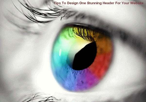
One way to make a stunning header is to choose the right colors. Some colors are more noticeable than others and if you choose to highlight those colors, they will stand out even more. Reds, yellow and oranges are generally more noticeable than blue, black or green. It is recommended to use reds and oranges as the main colors and then highlight them in such a way your eyes can’t help but be drawn to them.
Larger Font Size :
If your header is the same size as the content on your website, it is going to blend in. The whole idea is to have a stunning header that is going to be noticed. Use a font that is larger than the text. You should consider going 3 to 4 times larger in size to get the best effect and to draw in more visitors. Use a font that is going to be large enough to be noticed above the rest of the text and content on the page.
Short and to the Point :
It is best to keep your header short. You should not add words like a, an and the. Use the words necessary to get the point across but don’t say too much. You can do that with the content that follows the header. A header is designed to explain the content but should not be considered part of the content.
Choose the Right Layout :
Chances are there is more on the website than just the header and content. You will want to space your header nicely amongst the graphics and the text. Don’t put the graphics, text and header too close together or it could overwhelm the visitors that you have. You want the visitors to read the content. They may go elsewhere if you have a confusing website where the graphics and header are too close together.
Good Style Font :
Besides the size of the font you have dozens of choices of type of font. You should choose something that will add to your website by choosing a font that fits in nicely. It is also a good idea for your header to be a different font than the content on the website. It will be more stunning and will stand out better than those that are the same as the content.
Place Near Content that is Relevant :
The header should be placed near content that is relevant. If you have a header that is completely different than the content, your visitors will get confused and will go elsewhere. What you need to do is make sure their expectations are met. They are reading the header, noticing the header and now they expect to read something that relates to the header. That is why it is so important to put the header near the right content.
Be Consistent :
Although there is going to be a main header to your website, the content could contain headings too. The headings will further explain what else is in the content. Don’t make the header and the headings different fonts. This could look interesting but it often will confuse your visitors and they will go somewhere else to do their business. Consistency will pay off when using headers and headings.
Don’t Forget Keywords :
If you put keywords in your header you can have better luck getting pulled up on search engines. Put the keywords in so they make sense however or your visitors will not stay on your website. They will expect the keywords to relate to the website so make sure they do.
Headers can really stand out and be stunning if you do the right things. Remember that other people will be able to tell you if a header works for them or not. Since they are closer to your visitors, their opinion should be considered.
